Font type and size settings
Editing navigation and agenda layout
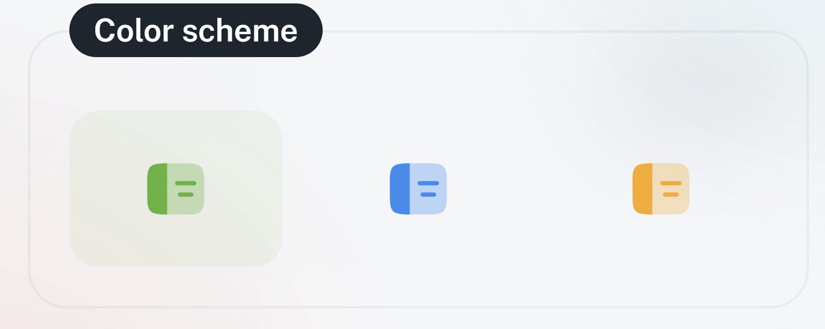
Color scheme – primary color, light or dark mode
Customizing info display density (row density, font size).
Layout settings in the agenda

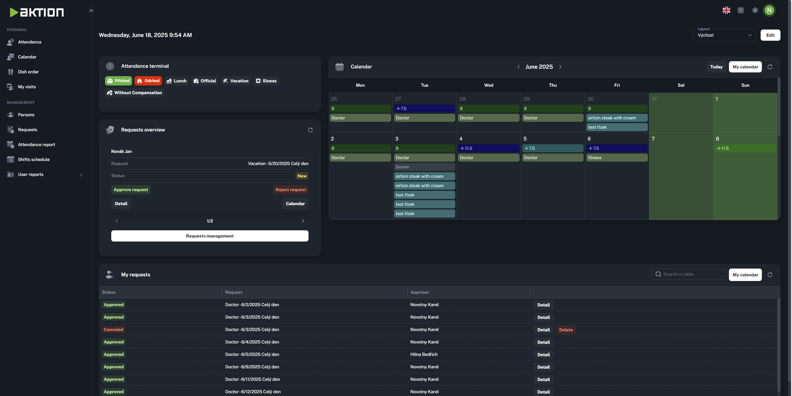
You can get to the appearance settings by clicking the gear icon in the top right corner. A sidebar will open up where you’ll find all the settings you need.
The appearance settings let you tweak the basics so the app fits your style. These options change the look of the whole app.
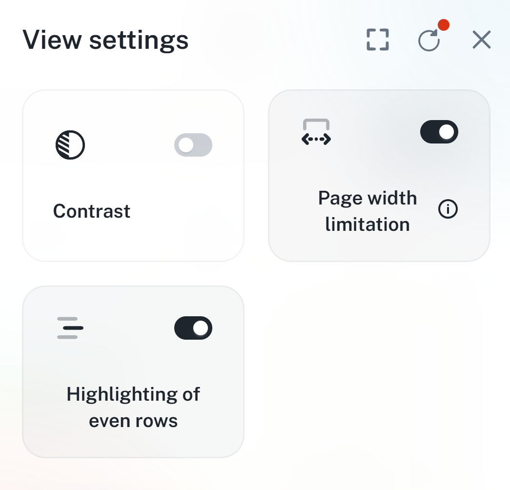
Fullscreen - Shows the app on the whole screen, making the system bar and tabs disappear just like pressing F11.
Inactive:

Active:

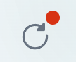
Reset settings - this option resets the app’s appearance settings back to defaults. Any changes from the default will show a red dot above the icon.
Before the change:

After the change:
Close button - closes the settings side panel

This feature changes the originally white background to a grayish color and highlights individual sections, so it's easier to get around in the app. This setting only applies to Light Mode.
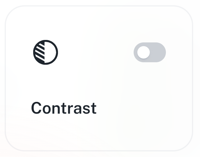
Before turning on contrast:
After turning on contrast:

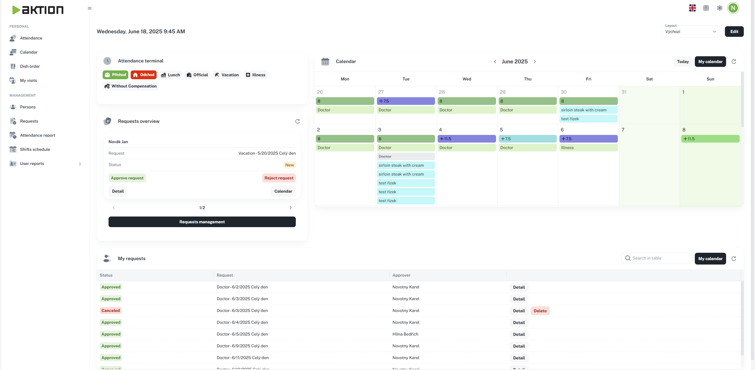
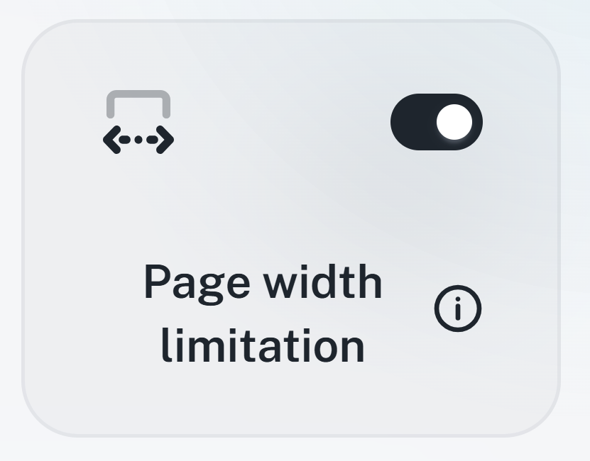
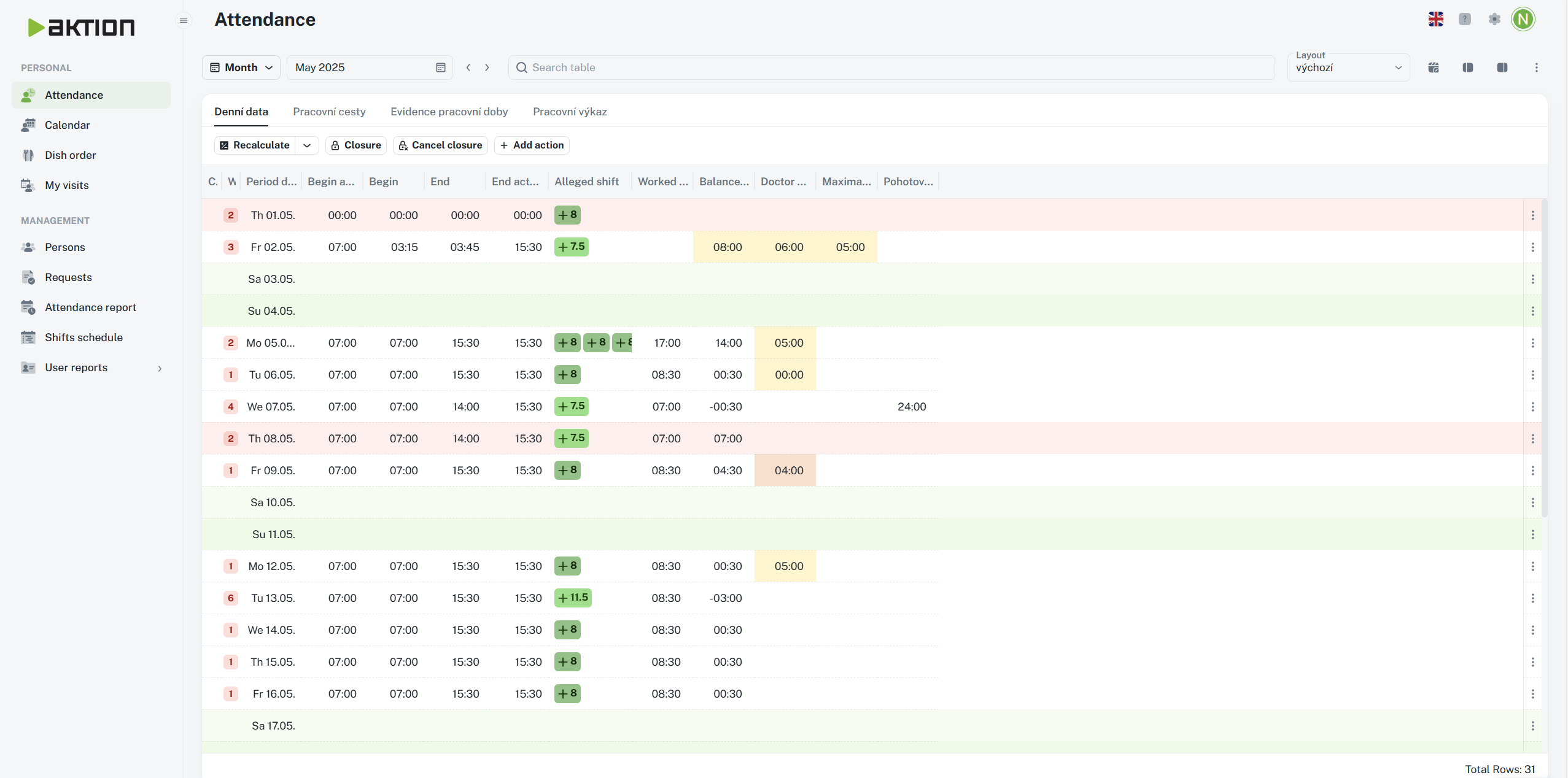
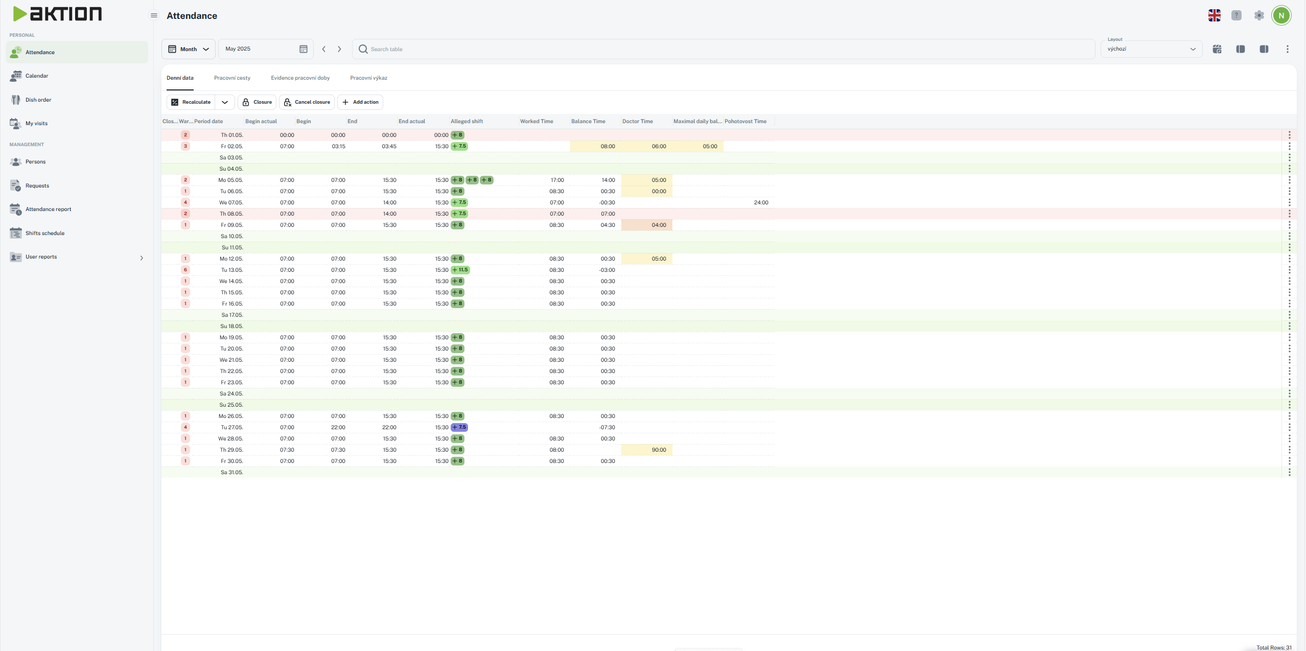
The agenda shows up with a fixed width that adapts to your current resolution and the set distance from the left and right edge.
Before width limit:
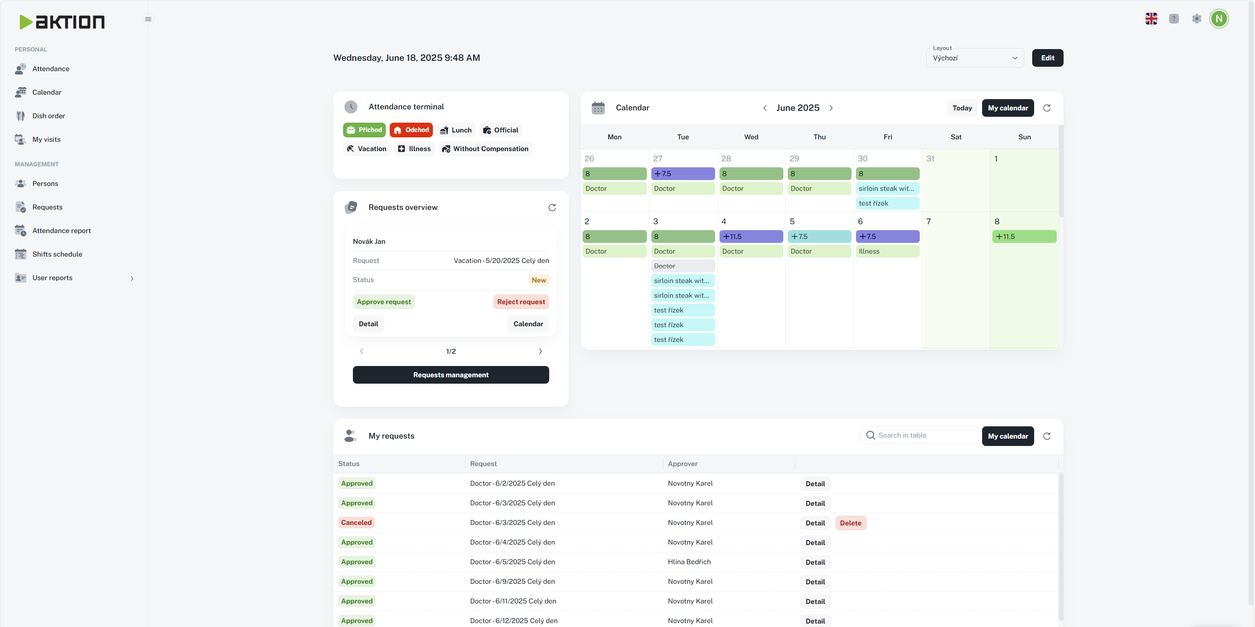
After width limit:
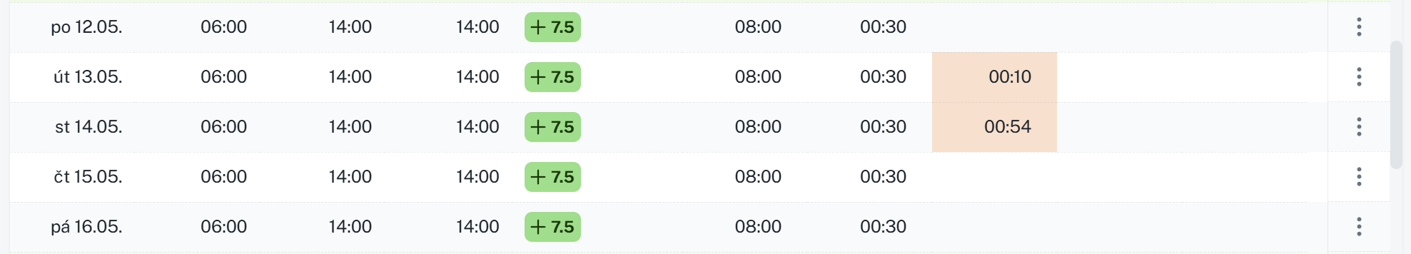
It highlights even rows in tables in each agenda with a light gray color, so it’s easier to keep track of the data.
Before highlighting:
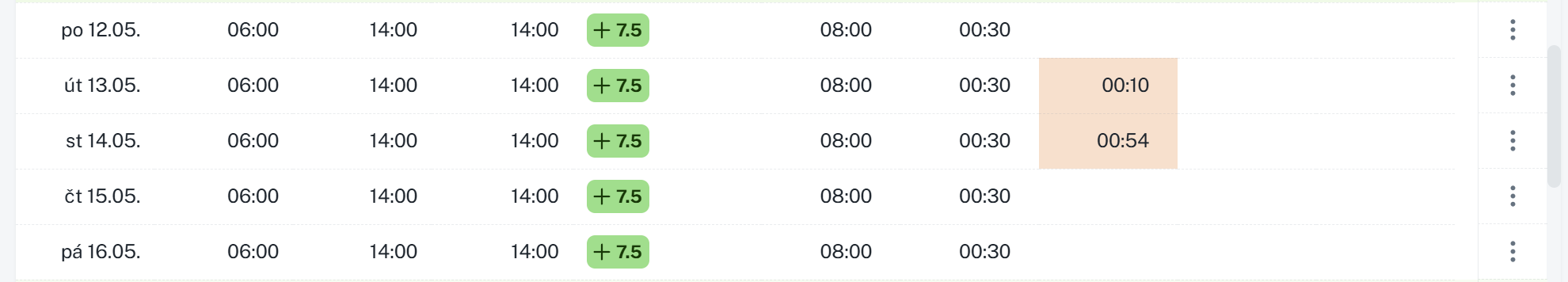
After highlighting:
The settings are split into two parts: picking an overall app theme and choosing a main color for things like weekends or marked tabs.
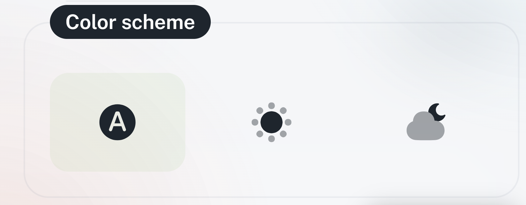
Automatic - the app theme will automatically match your system settings, switching between light or dark mode based on your current system theme.
Light - the app’s light theme, default look
Icon:
Preview:
Dark - the app’s dark theme
Icon:
Preview:
Green - default setting
Blue
Orange
By combining these settings, you can adjust the size of individual entries and the text to your liking, making the software easier and more pleasant to use.
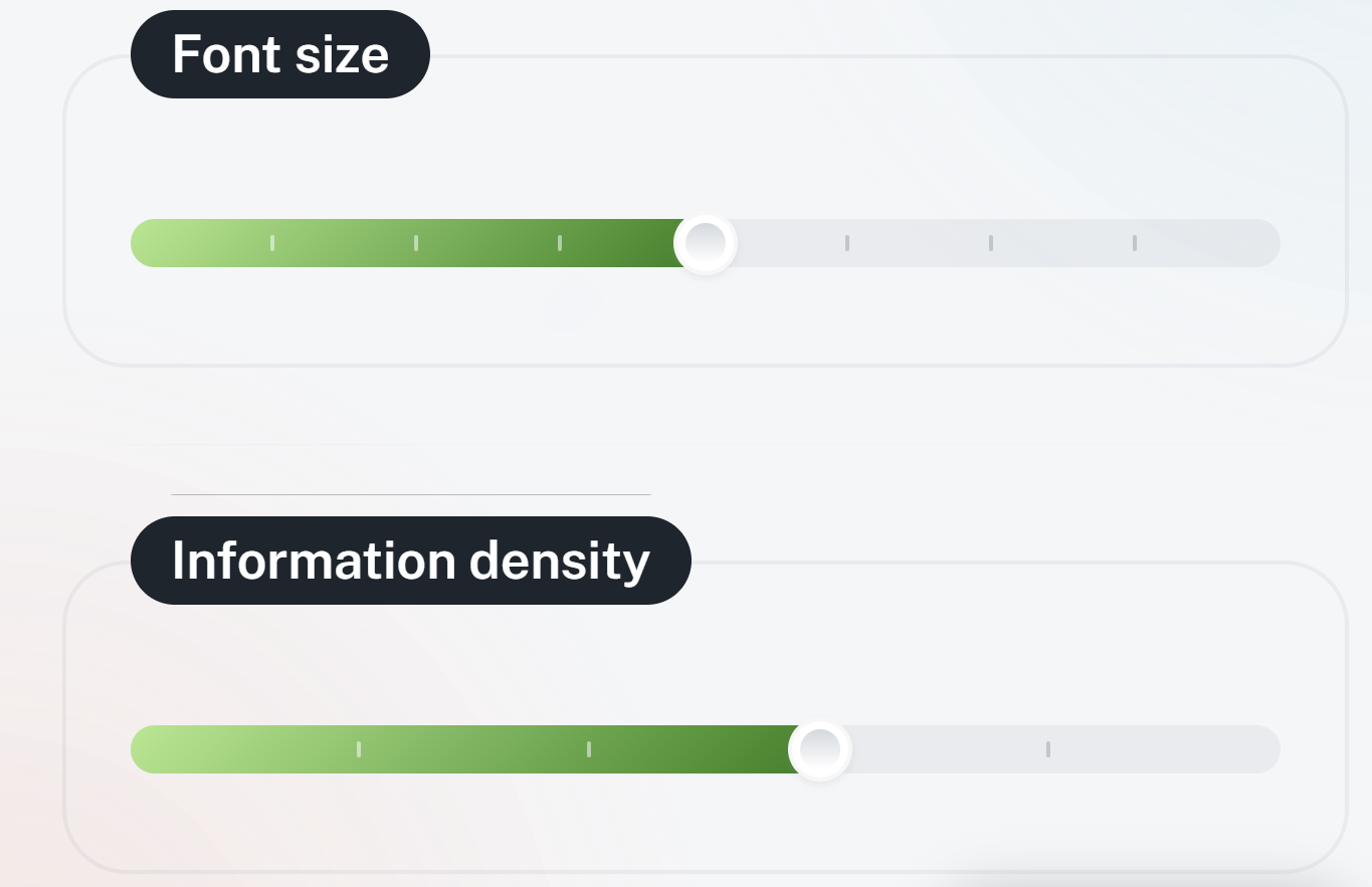
To give you a better idea, below is a comparison of the default setup and the adjusted view.
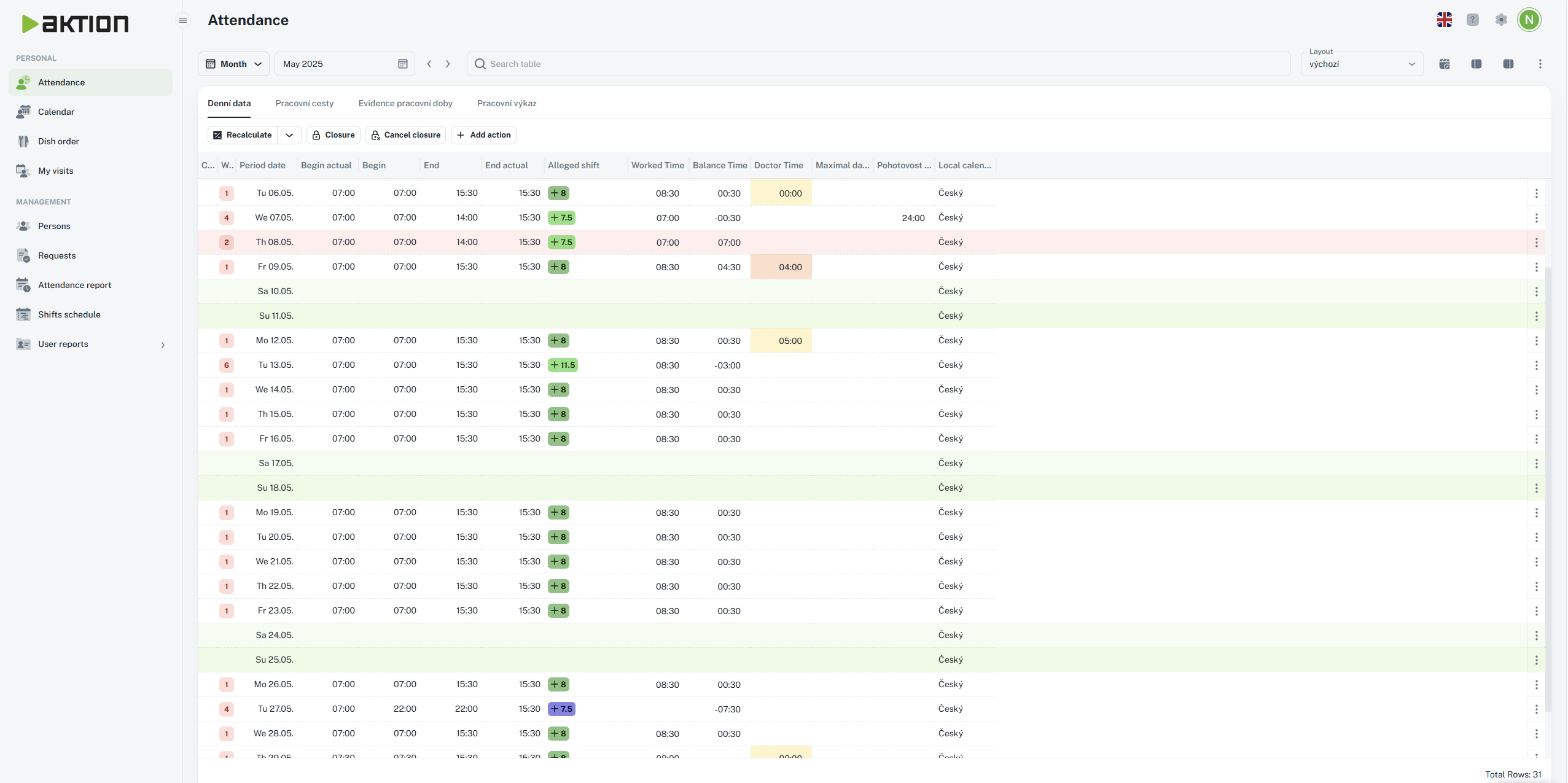
Default
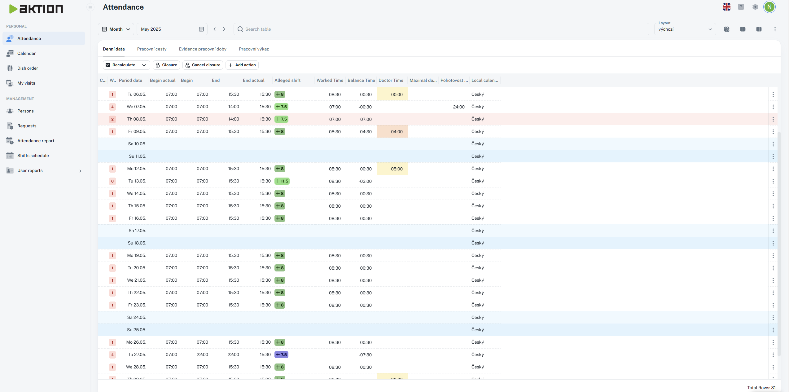
Enlarged
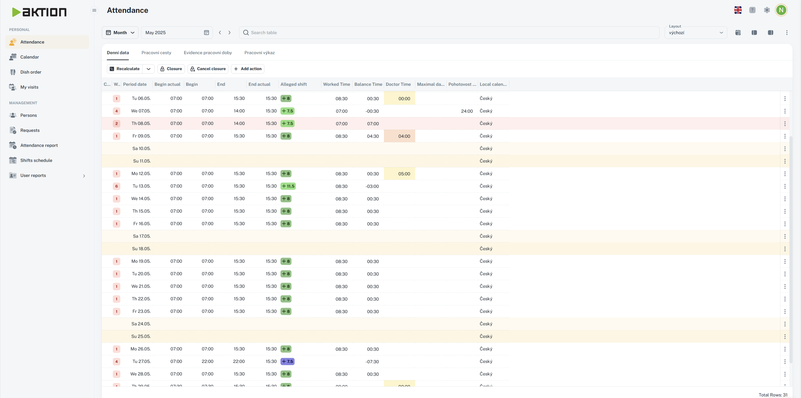
Minimized
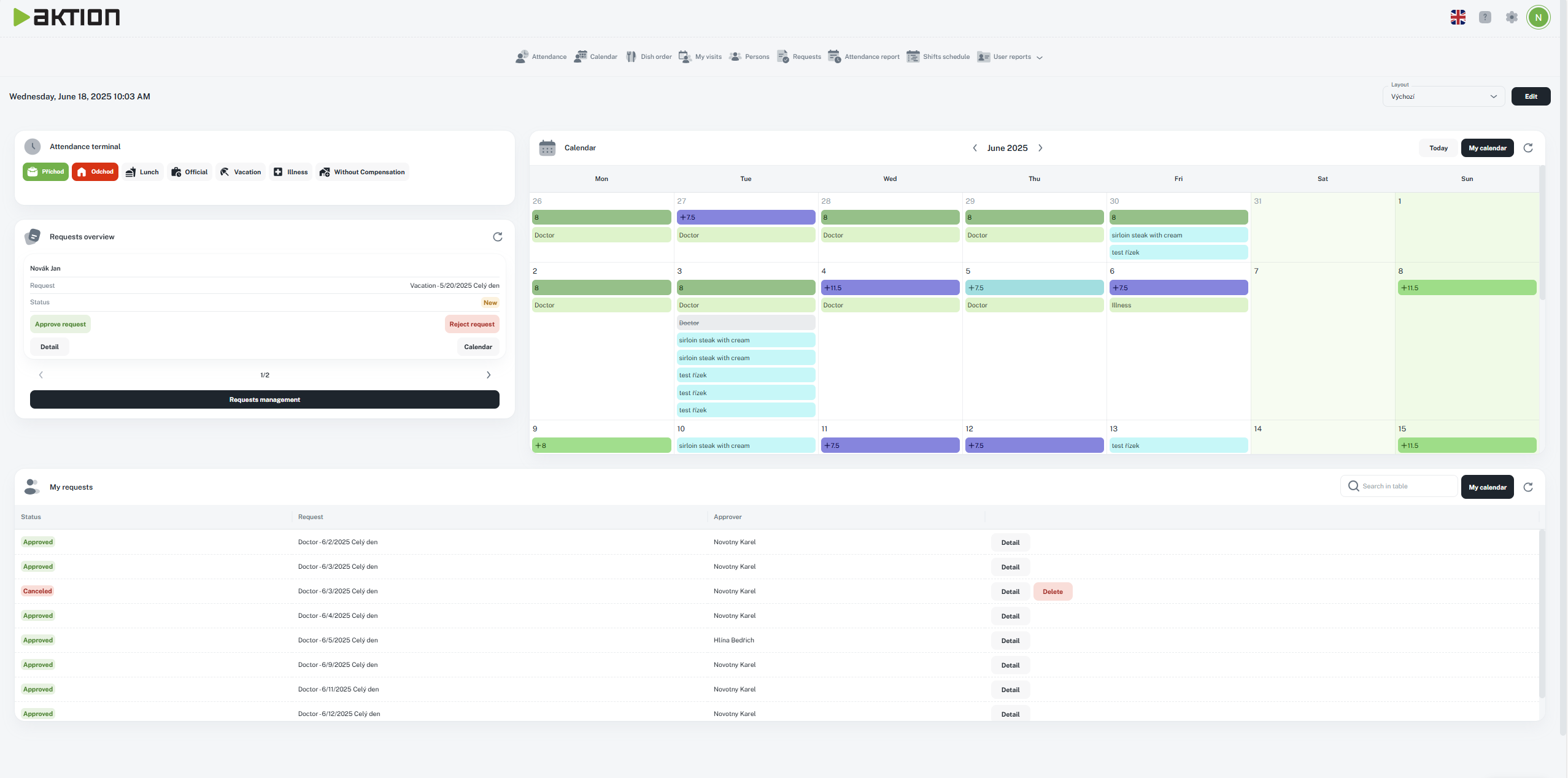
Sets the position of navigation and agenda
Navigation out, agenda on the right - default setting
Icon:

View:
Navigation on top, agenda below
Icon:
View:
Navigation in, agenda on the right
Icon:
View:
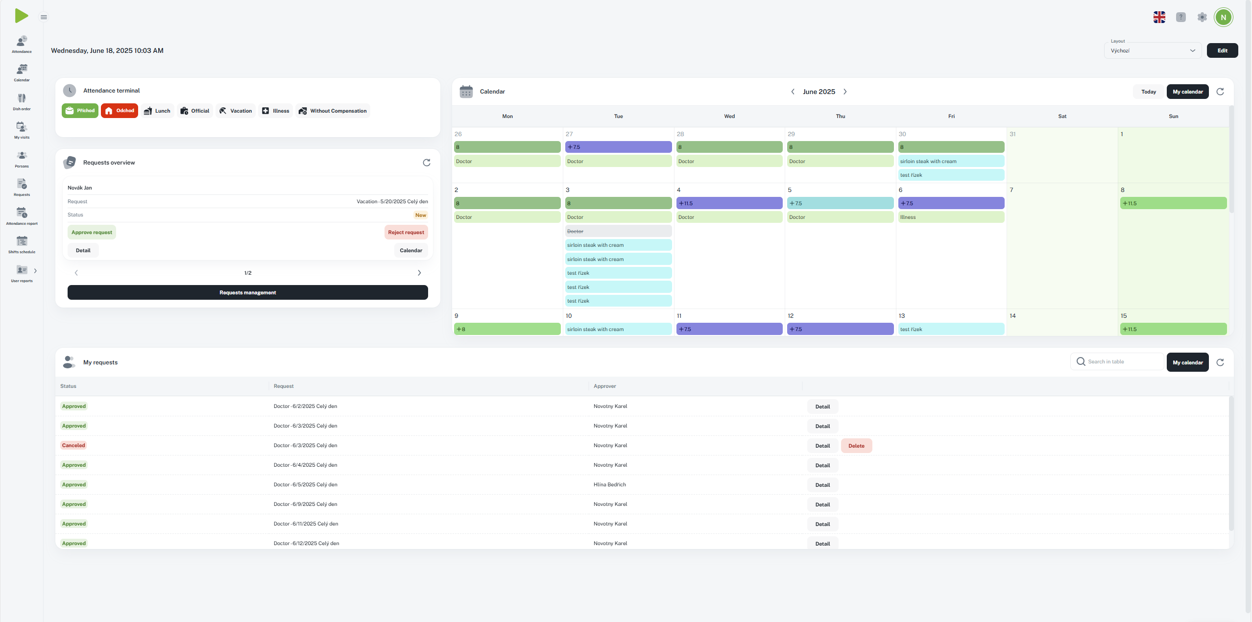
You can also slide the navigation in and out with the icon next to the logo.
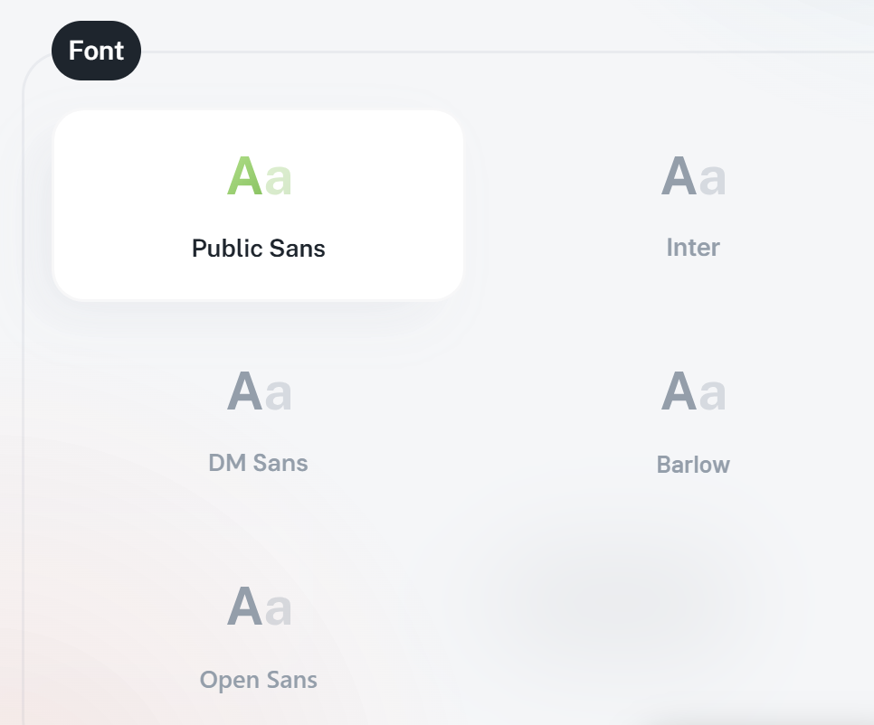
You can pick from 5 different fonts that change how text looks in the whole app.
Every section lets you set up your own layout, so you can adjust the display just how you need it.
You can pick which columns show up in the section by using the “Column picker” icon. Then, you can set up their order and width.
After you tweak the layout, you get to choose how to save these settings.
Don't tick any of the displayed settings.
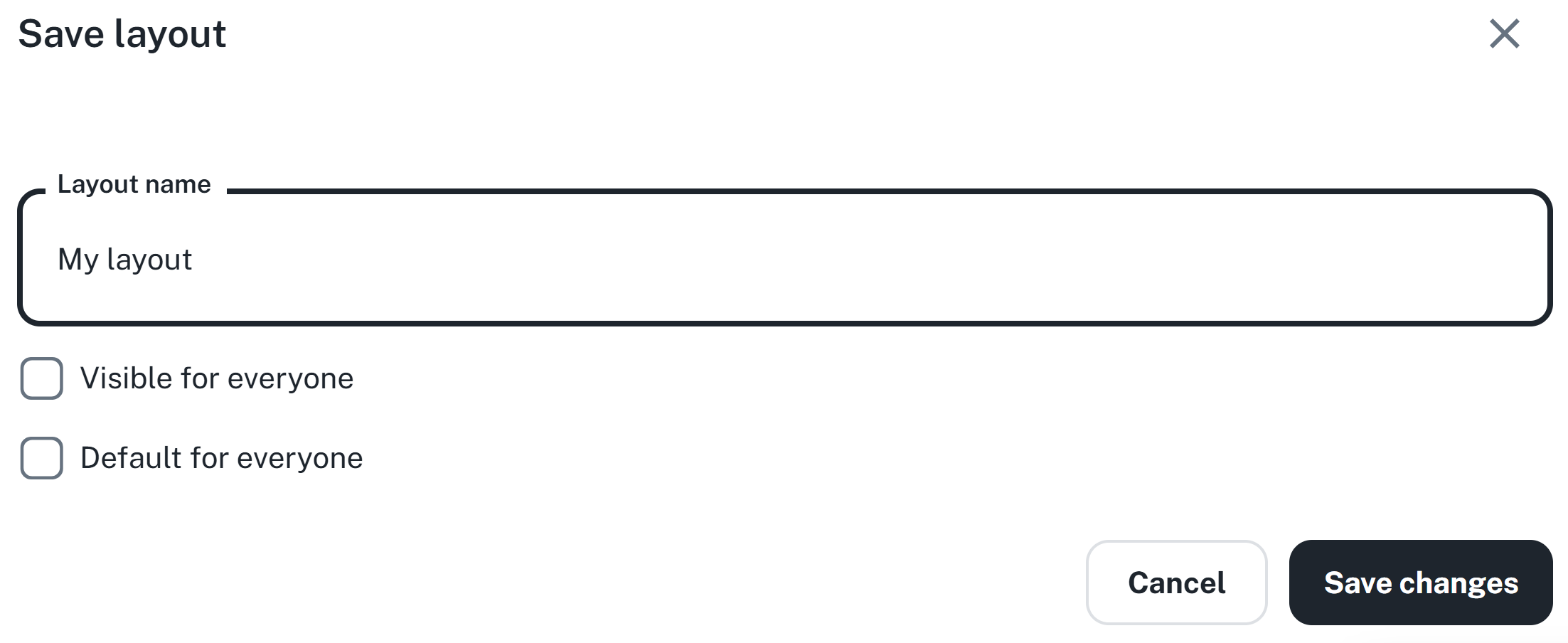
Visible to everyone – the layout will be available to other users, but everyone can pick something else.
Set as default for everyone – your setting will become the default for all users.
If you change this default layout later, the changes will automatically sync to all users who use the default view.
Thanks to this feature, you can easily create a unified look for agendas for the whole team, or customize things just for yourself.