Web plugins make it possible to create custom user reports using registered web components. Plugins are loaded dynamically from the folder AktionNEXT\eNextWeb\assets\plugins and can use authentication and other services provided by the main application. In the directory you can also find the sample plugin example-plugin.js.
In the assets directory, create a JavaScript file, for example: nazevPluginu.js
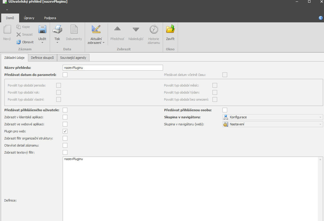
After creating the file, you must create a user report in the system; you can find it in the agenda Code lists → User reports.
Then create a report with the same name; for the plugin to work, you must set:
The Name and Definition must have the same name as the plugin name
Checked “Plugin for web”
```javascript
window.PLUGIN = window.PLUGIN || {};

// (Optional) Loading styles
(function loadStyles() {
  const styleId = 'plugin-styles';
  if (document.getElementById(styleId)) {
    return;
  }

  const style = document.createElement('style');
  style.id = styleId;
  style.textContent = `
    /* Your CSS styles here */
    .muj-plugin {
      padding: 20px;
    }
  `;

  document.head.appendChild(style);
})();

// Plugin initialization function
window.PLUGIN.init = function (containerId) {
  const container = document.getElementById(containerId || 'plugin-root');

  if (!container) {
    console.error('Container element not found');
    return;
  }

  // Creating HTML content using web components
  const content = `
    <div class="muj-plugin">
      <app-card variant="outlined">
        <app-card-content>
          <app-typography variant="h4">Můj plugin</app-typography>
          <app-typography variant="body1">Hello World!</app-typography>
        </app-card-content>
      </app-card>
    </div>
  `;

  container.innerHTML = content;

  // (Optional) Registration of event listeners
  container.addEventListener('click', (event) => {
    // Your handler logic
  });
};
```Namespace
window.PLUGIN = window.PLUGIN || {};Init function
window.PLUGIN.init = function(containerId) { ... }Return value - the function must set “container.innerHTML“ with the HTML content
window.gerAvailableWebComponents()
```javascript
const components = window.getAvailableWebComponents?.() || [];
// Vrací: string[] - pole názvů tagů, např. ["app-button", "app-card", ...]
```For detailed documentation of the properties and API of individual MUI components, please visit: MUI documentation
Examples of component usage:
#### Alert

- **Tag**: `<app-alert>`
- **Attributes**: `severity` (error|warning|info|success), `variant` (standard|filled|outlined)
- **Documentation**: https://mui.com/material-ui/react-alert/

```html
<app-alert severity="warning">Warning!</app-alert>
<app-alert severity="success">Success!</app-alert>
```

#### Avatar

- **Tag**: `<app-avatar>`
- **Attributes**: `alt`, `src`, `variant` (circular|rounded|square)
- **Documentation**: https://mui.com/material-ui/react-avatar/

```html
<app-avatar alt="John Doe" src="https://example.com/avatar.jpg"></app-avatar>
<app-avatar variant="rounded" src="/path/to/image.jpg"></app-avatar>
```

#### Badge

- **Tag**: `<app-badge>`
- **Attributes**: `badgecontent`, `color` (default|primary|secondary|error|info|success|warning), `variant`, `max`
- **Documentation**: https://mui.com/material-ui/react-badge/

```html
<app-badge badgecontent="4" color="primary">
  <app-avatar alt="User" src="/avatar.jpg"></app-avatar>
</app-badge>
```

**Note**: Badge requires a children element that it wraps. You can use other web components as children.

#### Button

- **Tag**: `<app-button>`
- **Attributes**: `variant` (text|outlined|contained), `color` (primary|secondary|error|warning|info|success), `size` (small|medium|large), `disabled` (boolean), `fullwidth` (boolean)
- **Documentation**: https://mui.com/material-ui/react-button/

```html
<app-button variant="contained" color="primary">Click</app-button>
<app-button variant="outlined" disabled>Disabled</app-button>
<app-button variant="text" size="small">Small button</app-button>
```

**Note**: For boolean attributes it is sufficient to specify the attribute without a value:

```html
<app-button disabled>Disabled</app-button>
<!-- is the same as -->
<app-button disabled="true">Disabled</app-button>
```

#### Card and CardContent

- **Tag**: `<app-card>` and `<app-card-content>`
- **Card attributes**: `variant` (elevation|outlined), `elevation` (0-24)
- **Documentation**: https://mui.com/material-ui/react-card/

```html
<app-card variant="outlined">
  <app-card-content>
    <app-typography variant="h5">Card title</app-typography>
    <app-typography variant="body2">Card content</app-typography>
  </app-card-content>
</app-card>
```

#### Chip

- **Tag**: `<app-chip>`
- **Attributes**: `label`, `color` (default|primary|secondary|error|info|success|warning), `variant` (filled|outlined), `size` (small|medium)
- **Documentation**: https://mui.com/material-ui/react-chip/

```html
<app-chip label="Active" color="success"></app-chip>
<app-chip label="Tag" variant="outlined"></app-chip>
```

#### CircularProgress

- **Tag**: `<app-circular-progress>`
- **Attributes**: `color` (primary|secondary|error|info|success|warning|inherit), `size` (number), `variant` (determinate|indeterminate), `value` (0-100)
- **Documentation**: https://mui.com/material-ui/react-progress/

```html
<app-circular-progress color="primary"></app-circular-progress>
<app-circular-progress variant="determinate" value="75"></app-circular-progress>
```

#### Divider

- **Tag**: `<app-divider>`
- **Attributes**: `orientation` (horizontal|vertical), `variant` (fullWidth|inset|middle), `textalign` (left|center|right), `flexitem` (boolean)
- **Documentation**: https://mui.com/material-ui/react-divider/

```html
<app-divider></app-divider>
<app-divider orientation="horizontal" textalign="center">CENTER</app-divider>
```

#### LinearProgress

- **Tag**: `<app-linear-progress>`
- **Attributes**: `color` (primary|secondary|error|info|success|warning|inherit), `variant` (determinate|indeterminate|buffer|query), `value` (0-100), `valuebuffer` (0-100)
- **Documentation**: https://mui.com/material-ui/react-progress/

```html
<app-linear-progress color="primary"></app-linear-progress>
<app-linear-progress variant="determinate" value="50"></app-linear-progress>
```

#### Link

- **Tag**: `<app-link>`
- **Attributes**: `href`, `color` (primary|secondary|error|info|success|warning|inherit), `underline` (none|hover|always), `variant`
- **Documentation**: https://mui.com/material-ui/react-link/

```html
<app-link href="#" color="primary">Primary link</app-link>
<app-link href="https://example.com" underline="always">Always underlined</app-link>
```

#### Paper

- **Tag**: `<app-paper>`
- **Attributes**: `elevation` (0-24), `variant` (elevation|outlined), `square` (boolean), `sx` (JSON string for styling)
- **Documentation**: https://mui.com/material-ui/react-paper/

```html
<app-paper elevation="3">
  <div style="padding: 20px;">Content</div>
</app-paper>

<!-- Using the sx prop for advanced styling -->
<app-paper sx='{"p": 2.5, "width": 200, "textAlign": "center"}'>
  <div>Centered content</div>
</app-paper>
```

**Note**: The `sx` prop accepts a JSON string with MUI sx values.

#### Skeleton

- **Tag**: `<app-skeleton>`
- **Attributes**: `variant` (text|circular|rectangular|rounded), `animation` (pulse|wave|false), `width` (number), `height` (number)
- **Documentation**: https://mui.com/material-ui/react-skeleton/

```html
<app-skeleton variant="text" width="200" height="30"></app-skeleton>
<app-skeleton variant="circular" width="40" height="40"></app-skeleton>
<app-skeleton variant="rectangular" width="300" height="100"></app-skeleton>
```

#### Typography

- **Tag**: `<app-typography>`
- **Attributes**: `variant` (h1|h2|h3|h4|h5|h6|subtitle1|subtitle2|body1|body2|caption|button|overline), `color` (textPrimary|textSecondary|primary|secondary|error|...), `align` (left|center|right|justify)
- **Documentation**: https://mui.com/material-ui/react-typography/

```html
<app-typography variant="h3">Heading</app-typography>
<app-typography variant="body1" color="textSecondary">Secondary text</app-typography>
<app-typography variant="caption">Small text</app-typography>
```

### 5.2 Custom components (2)

#### Loading

- **Tag**: `<app-loading>`
- **Attributes**: `message` (text), `height` (number in px)
- **Description**: Displays a loading indicator with a message

```html
<app-loading message="Loading data..." height="100"></app-loading>
```

#### HtmlWhiteTooltip

- **Tag**: `<app-white-tooltip>`
- **Attributes**: `text` (HTML string), `placement` (top|bottom|left|right|top-start|top-end|...)
- **Description**: White tooltip with support for HTML content
- **Children**: Must contain one child element

```html
<!-- Simple tooltip -->
<app-white-tooltip text="Help" placement="top">
  <app-button variant="outlined">Button with help</app-button>
</app-white-tooltip>

<!-- HTML formatting -->
<app-white-tooltip text="<b>Bold</b> and <i>italic</i>" placement="bottom">
  <app-chip label="Info" color="info"></app-chip>
</app-white-tooltip>

<!-- Complex data -->
<app-white-tooltip
  text="<div style='text-align: left;'><b>User:</b> John Novák<br><b>Email:</b> [email protected]<br><b>Status:</b> <span style='color: green;'>Active</span></div>"
  placement="right"
>
  <app-chip label="Show info"></app-chip>
</app-white-tooltip>For better performance, use event delegation - listen on the container instead of individual elements:
```javascript
window.PLUGIN.init = function (containerId) {
  const container = document.getElementById(containerId || 'plugin-root');

  let clickCounter = 0;

  const content = `
    <div>
      <app-button variant="contained" data-action="increment">+1</app-button>
      <app-button variant="contained" data-action="decrement">-1</app-button>
      <app-typography variant="h5" id="counter">0</app-typography>
    </div>
  `;

  container.innerHTML = content;

  // Event listener na containeru
  container.addEventListener('click', (event) => {
    const target = event.target.closest('[data-action]');
    if (!target) return;

    const action = target.getAttribute('data-action');
    const counterEl = document.getElementById('counter');

    if (action === 'increment') {
      clickCounter++;
    } else if (action === 'decrement') {
      clickCounter--;
    }

    if (counterEl) {
      counterEl.textContent = clickCounter;
    }
  });
};
``````javascript
container.addEventListener('click', async (event) => {
const target = event.target.closest('[data-action="refresh-token"]');
if (!target) return;
target.setAttribute('disabled', 'true');
target.textContent = 'Obnovuji...';
try {
const newToken = await window.authApi?.renewToken();
if (newToken) {
target.textContent = 'Token obnoven!';
} else {
target.textContent = 'Chyba';
}
} finally {
setTimeout(() => {
target.removeAttribute('disabled');
target.textContent = 'Obnovit Token';
}, 2000);
}
});
``````javascript
const dynamicContentId = 'dynamic-area';
const content = `
<div>
<app-button data-action="show-info">Show info</app-button>
<div id="${dynamicContentId}"></div>
</div>
`;
container.innerHTML = content;
container.addEventListener('click', (event) => {
if (event.target.closest('[data-action="show-info"]')) {
const dynamicArea = document.getElementById(dynamicContentId);
dynamicArea.innerHTML = `
<app-alert severity="info">
Dynamically inserted content!
</app-alert>
`;
}
});
``````javascript
(function loadStyles() {
const styleId = 'muj-plugin-styles';
if (document.getElementById(styleId)) return;
const style = document.createElement('style');
style.id = styleId;
style.textContent = `
.muj-plugin-wrapper {
padding: 20px;
max-width: 1200px;
margin: 0 auto;
}
.muj-plugin-grid {
display: grid;
grid-template-columns: repeat(auto-fit, minmax(300px, 1fr));
gap: 20px;
}
.muj-plugin-header {
background: linear-gradient(135deg, #667eea 0%, #764ba2 100%);
color: white;
padding: 30px;
border-radius: 12px;
margin-bottom: 30px;
}
`;
document.head.appendChild(style);
})();
``````html
<div style="display: flex; gap: 10px; flex-wrap: wrap;">
<app-button variant="contained">Button 1</app-button>
<app-button variant="outlined">Button 2</app-button>
</div>
```For components supporting “sx”, for example “Paper“:
```html
<app-paper sx='{"p": 3, "bgcolor": "background.paper", "borderRadius": 2}'>
  <div>Stylized Paper</div>
</app-paper>
``````javascript
window.PLUGIN.init = function (containerId) {
const container = document.getElementById(containerId || 'plugin-root');
if (!container) {
console.error('Plugin container not found:', containerId);
return;
}
// Continue with initialization...
};
``````javascript
// Always use optional chaining (?.)
const user = window.authApi?.getUser();
const components = window.getAvailableWebComponents?.() || [];
// Check for existence before use
if (window.authApi) {
const token = window.authApi.getToken();
// ...
}
``````javascript
window.PLUGIN.init = function (containerId) {
console.log('Plugin initialized with containerId:', containerId);
const user = window.authApi?.getUser();
console.log('Current user:', user);
const components = window.getAvailableWebComponents?.();
console.log('Available components:', components);
// ... rest of the code
};
``````javascript
window.PLUGIN.init = function(containerId) {
try {
const container = document.getElementById(containerId || 'plugin-root');
if (!container) {
throw new Error(`Container ${containerId} not found`);
}
// Plugin initialization
container.innerHTML = /* ... */;
} catch (error) {
console.error('Plugin initialization failed:', error);
// Displaying the error to the user
const errorContainer = document.getElementById(containerId);
if (errorContainer) {
errorContainer.innerHTML = `
<app-alert severity="error">
The plugin could not be loaded: ${error.message}
</app-alert>
`;
}
}
};
``````javascript
window.PLUGIN = window.PLUGIN || {};
// Načtení stylů
(function loadStyles() {
const styleId = 'demo-plugin-styles';
if (document.getElementById(styleId)) return;
const style = document.createElement('style');
style.id = styleId;
style.textContent = `
.demo-plugin {
padding: 20px;
max-width: 1200px;
margin: 0 auto;
}
.demo-grid {
display: grid;
gap: 20px;
margin-top: 20px;
}
`;
document.head.appendChild(style);
})();
// Inicializace pluginu
window.PLUGIN.init = function (containerId) {
const container = document.getElementById(containerId || 'plugin-root');
if (!container) {
console.error('Container not found');
return;
}
// Získání dat z authApi
const user = window.authApi?.getUser();
const tokenExpired = window.authApi?.isTokenExpired();
// Vytvoření obsahu
const content = `
<div class="demo-plugin">
<!-- Header -->
<app-card variant="outlined">
<app-card-content>
<app-typography variant="h4">Demo Plugin</app-typography>
<app-typography variant="body2">
User: ${user ? user.personName || user.userName : 'Not logged in'}
${tokenExpired ? '(Token expired)' : ''}
</app-typography>
</app-card-content>
</app-card>
<!-- Interaktivní část -->
<div class="demo-grid">
<app-card variant="outlined">
<app-card-content>
<app-typography variant="h6">Click counter</app-typography>
<div style="display: flex; gap: 10px; align-items: center; margin-top: 10px;">
<app-button variant="contained" color="primary" data-action="increment">
+1
</app-button>
<app-button variant="contained" color="secondary" data-action="decrement">
-1
</app-button>
<app-button variant="outlined" data-action="reset">
Reset
</app-button>
<app-typography variant="h5" id="counter">0</app-typography>
</div>
</app-card-content>
</app-card>
<app-card variant="outlined">
<app-card-content>
<app-typography variant="h6">Actions</app-typography>
<div style="display: flex; gap: 10px; margin-top: 10px;">
<app-button variant="contained" color="info" data-action="show-components">
List of components
</app-button>
<app-button variant="contained" color="success" data-action="refresh-token">
Refresh Token
</app-button>
</div>
</app-card-content>
</app-card>
<!-- Dynamický obsah -->
<div id="dynamic-content"></div>
</div>
</div>
`;
container.innerHTML = content;
// Event handling
let counter = 0;
container.addEventListener('click', async (event) => {
const target = event.target.closest('[data-action]');
if (!target) return;
const action = target.getAttribute('data-action');
const counterEl = document.getElementById('counter');
const dynamicContent = document.getElementById('dynamic-content');
switch (action) {
case 'increment':
counter++;
if (counterEl) counterEl.textContent = counter;
break;
case 'decrement':
counter--;
if (counterEl) counterEl.textContent = counter;
break;
case 'reset':
counter = 0;
if (counterEl) counterEl.textContent = counter;
break;
case 'show-components':
const components = window.getAvailableWebComponents?.() || [];
if (dynamicContent) {
dynamicContent.innerHTML = `
<app-card variant="outlined">
<app-card-content>
<app-typography variant="h6">
Available components (${components.length})
</app-typography>
<ul style="margin: 10px 0;">
${components.map((comp) => `<li><code><${comp}></code></li>`).join('')}
</ul>
</app-card-content>
</app-card>
`;
}
break;
case 'refresh-token':
target.setAttribute('disabled', 'true');
const originalText = target.textContent;
target.textContent = 'Refreshing...';
try {
const newToken = await window.authApi?.renewToken();
if (newToken) {
if (dynamicContent) {
dynamicContent.innerHTML = `
<app-alert severity="success">Token successfully refreshed!</app-alert>
`;
}
} else {
if (dynamicContent) {
dynamicContent.innerHTML = `
<app-alert severity="error">Failed to refresh token</app-alert>
`;
}
}
} catch (error) {
console.error('Token refresh error:', error);
} finally {
setTimeout(() => {
target.removeAttribute('disabled');
target.textContent = originalText;
}, 2000);
}
break;
}
});
};
```
## 10. Troubleshooting
### Problem: Plugin does not load
- Verify that the file name exactly matches `webPluginName` in the User overview record
- Verify the path: `public/assets/plugins/{NazevPluginu}.js`
- Check the browser console for JavaScript errors
### Problem: Components are not displayed
- Verify that you are using the correct tag names (e.g. `app-button`, not `button`)
- Verify that the web components are initialized (they are started automatically when the application is loaded)
- Verify the attributes – some require specific values
### Problem: Event handlers do not work
- Use event delegation on the container
- Verify that the element has the `data-action` attribute or a similar identifier
- Check the console for errors in the event handler
### Problem: Styles do not work
- Verify that `styleId` is unique and that style loading has a guard (`if (document.getElementById(styleId))`)
- Verify that the CSS selectors are correct
- Verify CSS specificity
## 11. Checklist for creating a plugin
- [ ] File created in `public/assets/plugins/{NazevPluginu}.js`
- [ ] File name matches `webPluginName` in the system
- [ ] User overview record created with `isWebPlugin = true`
- [ ] Plugin has the namespace `window.PLUGIN`
- [ ] Plugin has an `init` function
- [ ] The `init` function checks for the existence of the container
- [ ] Only supported web components are used
- [ ] Event handling via event delegation
- [ ] Safe use of `window.authApi` (optional chaining)
- [ ] Styles loaded with a guard against duplicates
- [ ] Plugin tested in the browser
- [ ] Console checked for errors
---