---
title: "eNEXT - creation of custom plugins"
description: "Description and procedure for creating custom plugins for eNEXT"
url: https://navody.aktion.cz/en/articles/92-enext-creation-of-custom-plugins
collection: "Configurations manuls and FAQ"
updated: 2026-10-14
language: en
alternates: [cs]
---
# eNEXT - creation of custom plugins
Description and procedure for creating custom plugins for eNEXT
## Introduction
Web plugins make it possible to create custom user reports using registered web components. Plugins are loaded dynamically from the folder `AktionNEXT\eNextWeb\assets\plugins` and can use authentication and other services provided by the main application. In the directory you can also find the sample plugin example-plugin.js.
## Naming and registration of the plugin
### File name
In the assets directory, create a JavaScript file, for example: nazevPluginu.js
### Creating a user report
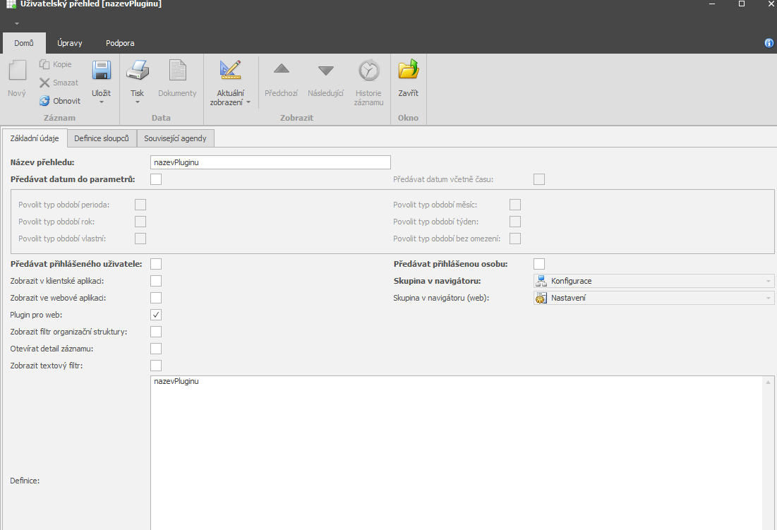
After creating the file, you must create a user report in the system; you can find it in the agenda Code lists → User reports.
Then create a report with the same name; for the plugin to work, you must set:
- The Name and Definition must have the same name as the plugin name
- Checked “Plugin for web”
## Basic plugin structure
### Minimal template
````javascript
```javascript
window.PLUGIN = window.PLUGIN || {};
// (Optional) Loading styles
(function loadStyles() {
const styleId = 'plugin-styles';
if (document.getElementById(styleId)) {
return;
}
const style = document.createElement('style');
style.id = styleId;
style.textContent = `
/* Your CSS styles here */
.muj-plugin {
padding: 20px;
}
`;
document.head.appendChild(style);
})();
// Plugin initialization function
window.PLUGIN.init = function (containerId) {
const container = document.getElementById(containerId || 'plugin-root');
if (!container) {
console.error('Container element not found');
return;
}
// Creating HTML content using web components
const content = `
`;
container.innerHTML = content;
// (Optional) Registration of event listeners
container.addEventListener('click', (event) => {
// Your handler logic
});
};
```
````
### Mandatory parts
- **Namespace**
```markdown
window.PLUGIN = window.PLUGIN || {};
```
- **Init function**
```markdown
window.PLUGIN.init = function(containerId) { ... }
```
- **Return value -** the function must set “container.innerHTML“ with the HTML content
## API available on the window object
### Object for working with authentication
### Function for obtaining a list of all registered web components
- window.gerAvailableWebComponents()
````javascript
```javascript
const components = window.getAvailableWebComponents?.() || [];
// Vrací: string[] - pole názvů tagů, např. ["app-button", "app-card", ...]
```
````
## Available components
### MUI components
For detailed documentation of the properties and API of individual MUI components, please visit: [MUI documentation](https://mui.com/material-ui/getting-started/)
Examples of component usage:
````javascript
#### Alert
- **Tag**: ``
- **Attributes**: `severity` (error|warning|info|success), `variant` (standard|filled|outlined)
- **Documentation**: https://mui.com/material-ui/react-alert/
```html
Warning!
Success!
```
#### Avatar
- **Tag**: ``
- **Attributes**: `alt`, `src`, `variant` (circular|rounded|square)
- **Documentation**: https://mui.com/material-ui/react-avatar/
```html
```
#### Badge
- **Tag**: ``
- **Attributes**: `badgecontent`, `color` (default|primary|secondary|error|info|success|warning), `variant`, `max`
- **Documentation**: https://mui.com/material-ui/react-badge/
```html
```
**Note**: Badge requires a children element that it wraps. You can use other web components as children.
#### Button
- **Tag**: ``
- **Attributes**: `variant` (text|outlined|contained), `color` (primary|secondary|error|warning|info|success), `size` (small|medium|large), `disabled` (boolean), `fullwidth` (boolean)
- **Documentation**: https://mui.com/material-ui/react-button/
```html
Click
Disabled
Small button
```
**Note**: For boolean attributes it is sufficient to specify the attribute without a value:
```html
Disabled
Disabled
```
#### Card and CardContent
- **Tag**: `` and ``
- **Card attributes**: `variant` (elevation|outlined), `elevation` (0-24)
- **Documentation**: https://mui.com/material-ui/react-card/
```html
Card title
Card content
```
#### Chip
- **Tag**: ``
- **Attributes**: `label`, `color` (default|primary|secondary|error|info|success|warning), `variant` (filled|outlined), `size` (small|medium)
- **Documentation**: https://mui.com/material-ui/react-chip/
```html
```
#### CircularProgress
- **Tag**: ``
- **Attributes**: `color` (primary|secondary|error|info|success|warning|inherit), `size` (number), `variant` (determinate|indeterminate), `value` (0-100)
- **Documentation**: https://mui.com/material-ui/react-progress/
```html
```
#### Divider
- **Tag**: ``
- **Attributes**: `orientation` (horizontal|vertical), `variant` (fullWidth|inset|middle), `textalign` (left|center|right), `flexitem` (boolean)
- **Documentation**: https://mui.com/material-ui/react-divider/
```html
CENTER
```
#### LinearProgress
- **Tag**: ``
- **Attributes**: `color` (primary|secondary|error|info|success|warning|inherit), `variant` (determinate|indeterminate|buffer|query), `value` (0-100), `valuebuffer` (0-100)
- **Documentation**: https://mui.com/material-ui/react-progress/
```html
```
#### Link
- **Tag**: ``
- **Attributes**: `href`, `color` (primary|secondary|error|info|success|warning|inherit), `underline` (none|hover|always), `variant`
- **Documentation**: https://mui.com/material-ui/react-link/
```html
Primary link
Always underlined
```
#### Paper
- **Tag**: ``
- **Attributes**: `elevation` (0-24), `variant` (elevation|outlined), `square` (boolean), `sx` (JSON string for styling)
- **Documentation**: https://mui.com/material-ui/react-paper/
```html
Content
Centered content
```
**Note**: The `sx` prop accepts a JSON string with MUI sx values.
#### Skeleton
- **Tag**: ``
- **Attributes**: `variant` (text|circular|rectangular|rounded), `animation` (pulse|wave|false), `width` (number), `height` (number)
- **Documentation**: https://mui.com/material-ui/react-skeleton/
```html
```
#### Typography
- **Tag**: ``
- **Attributes**: `variant` (h1|h2|h3|h4|h5|h6|subtitle1|subtitle2|body1|body2|caption|button|overline), `color` (textPrimary|textSecondary|primary|secondary|error|...), `align` (left|center|right|justify)
- **Documentation**: https://mui.com/material-ui/react-typography/
```html
Heading
Secondary text
Small text
```
### 5.2 Custom components (2)
#### Loading
- **Tag**: ``
- **Attributes**: `message` (text), `height` (number in px)
- **Description**: Displays a loading indicator with a message
```html
```
#### HtmlWhiteTooltip
- **Tag**: ``
- **Attributes**: `text` (HTML string), `placement` (top|bottom|left|right|top-start|top-end|...)
- **Description**: White tooltip with support for HTML content
- **Children**: Must contain one child element
```html
Button with help
````
## Event handling and interactivity
### Evenet delegation
For better performance, use event delegation - listen on the container instead of individual elements:
````javascript
```javascript
window.PLUGIN.init = function (containerId) {
const container = document.getElementById(containerId || 'plugin-root');
let clickCounter = 0;
const content = `
`;
container.innerHTML = content;
// Event listener na containeru
container.addEventListener('click', (event) => {
const target = event.target.closest('[data-action]');
if (!target) return;
const action = target.getAttribute('data-action');
const counterEl = document.getElementById('counter');
if (action === 'increment') {
clickCounter++;
} else if (action === 'decrement') {
clickCounter--;
}
if (counterEl) {
counterEl.textContent = clickCounter;
}
});
};
```
````
### Asynchronous operations
````javascript
```javascript
container.addEventListener('click', async (event) => {
const target = event.target.closest('[data-action="refresh-token"]');
if (!target) return;
target.setAttribute('disabled', 'true');
target.textContent = 'Obnovuji...';
try {
const newToken = await window.authApi?.renewToken();
if (newToken) {
target.textContent = 'Token obnoven!';
} else {
target.textContent = 'Chyba';
}
} finally {
setTimeout(() => {
target.removeAttribute('disabled');
target.textContent = 'Obnovit Token';
}, 2000);
}
});
```
````
### Dynamic updates
````javascript
```javascript
const dynamicContentId = 'dynamic-area';
const content = `
`;
container.innerHTML = content;
container.addEventListener('click', (event) => {
if (event.target.closest('[data-action="show-info"]')) {
const dynamicArea = document.getElementById(dynamicContentId);
dynamicArea.innerHTML = `
Dynamically inserted content!
`;
}
});
```
````
## Styling
### Custom CSS styles
````javascript
```javascript
(function loadStyles() {
const styleId = 'muj-plugin-styles';
if (document.getElementById(styleId)) return;
const style = document.createElement('style');
style.id = styleId;
style.textContent = `
.muj-plugin-wrapper {
padding: 20px;
max-width: 1200px;
margin: 0 auto;
}
.muj-plugin-grid {
display: grid;
grid-template-columns: repeat(auto-fit, minmax(300px, 1fr));
gap: 20px;
}
.muj-plugin-header {
background: linear-gradient(135deg, #667eea 0%, #764ba2 100%);
color: white;
padding: 30px;
border-radius: 12px;
margin-bottom: 30px;
}
`;
document.head.appendChild(style);
})();
```
````
### Inline styles
````javascript
```html
```
````
### MUI sx prop
For components supporting “sx”, for example “Paper“:
````javascript
```html
Stylized Paper
```
````
## Best Practices
### Checking for the existence of elements
````javascript
```javascript
window.PLUGIN.init = function (containerId) {
const container = document.getElementById(containerId || 'plugin-root');
if (!container) {
console.error('Plugin container not found:', containerId);
return;
}
// Continue with initialization...
};
```
````
### Cleanup during re-initialization
````javascript
```javascript
// Always use optional chaining (?.)
const user = window.authApi?.getUser();
const components = window.getAvailableWebComponents?.() || [];
// Check for existence before use
if (window.authApi) {
const token = window.authApi.getToken();
// ...
}
```
````
### Debugging
````javascript
```javascript
window.PLUGIN.init = function (containerId) {
console.log('Plugin initialized with containerId:', containerId);
const user = window.authApi?.getUser();
console.log('Current user:', user);
const components = window.getAvailableWebComponents?.();
console.log('Available components:', components);
// ... rest of the code
};
```
````
### Error handling
````javascript
```javascript
window.PLUGIN.init = function(containerId) {
try {
const container = document.getElementById(containerId || 'plugin-root');
if (!container) {
throw new Error(`Container ${containerId} not found`);
}
// Plugin initialization
container.innerHTML = /* ... */;
} catch (error) {
console.error('Plugin initialization failed:', error);
// Displaying the error to the user
const errorContainer = document.getElementById(containerId);
if (errorContainer) {
errorContainer.innerHTML = `
The plugin could not be loaded: ${error.message}
`;
}
}
};
```
````
## Example of a shortened example-plugin
````javascript
```javascript
window.PLUGIN = window.PLUGIN || {};
// Načtení stylů
(function loadStyles() {
const styleId = 'demo-plugin-styles';
if (document.getElementById(styleId)) return;
const style = document.createElement('style');
style.id = styleId;
style.textContent = `
.demo-plugin {
padding: 20px;
max-width: 1200px;
margin: 0 auto;
}
.demo-grid {
display: grid;
gap: 20px;
margin-top: 20px;
}
`;
document.head.appendChild(style);
})();
// Inicializace pluginu
window.PLUGIN.init = function (containerId) {
const container = document.getElementById(containerId || 'plugin-root');
if (!container) {
console.error('Container not found');
return;
}
// Získání dat z authApi
const user = window.authApi?.getUser();
const tokenExpired = window.authApi?.isTokenExpired();
// Vytvoření obsahu
const content = `
Demo Plugin
User: ${user ? user.personName || user.userName : 'Not logged in'}
${tokenExpired ? '(Token expired)' : ''}
Click counter
Actions
List of components
Refresh Token
`;
container.innerHTML = content;
// Event handling
let counter = 0;
container.addEventListener('click', async (event) => {
const target = event.target.closest('[data-action]');
if (!target) return;
const action = target.getAttribute('data-action');
const counterEl = document.getElementById('counter');
const dynamicContent = document.getElementById('dynamic-content');
switch (action) {
case 'increment':
counter++;
if (counterEl) counterEl.textContent = counter;
break;
case 'decrement':
counter--;
if (counterEl) counterEl.textContent = counter;
break;
case 'reset':
counter = 0;
if (counterEl) counterEl.textContent = counter;
break;
case 'show-components':
const components = window.getAvailableWebComponents?.() || [];
if (dynamicContent) {
dynamicContent.innerHTML = `
Available components (${components.length})
${components.map((comp) => `<${comp}>
`;
}
break;
case 'refresh-token':
target.setAttribute('disabled', 'true');
const originalText = target.textContent;
target.textContent = 'Refreshing...';
try {
const newToken = await window.authApi?.renewToken();
if (newToken) {
if (dynamicContent) {
dynamicContent.innerHTML = `
Token successfully refreshed!
`;
}
} else {
if (dynamicContent) {
dynamicContent.innerHTML = `
Failed to refresh token
`;
}
}
} catch (error) {
console.error('Token refresh error:', error);
} finally {
setTimeout(() => {
target.removeAttribute('disabled');
target.textContent = originalText;
}, 2000);
}
break;
}
});
};
```
## 10. Troubleshooting
### Problem: Plugin does not load
- Verify that the file name exactly matches `webPluginName` in the User overview record
- Verify the path: `public/assets/plugins/{NazevPluginu}.js`
- Check the browser console for JavaScript errors
### Problem: Components are not displayed
- Verify that you are using the correct tag names (e.g. `app-button`, not `button`)
- Verify that the web components are initialized (they are started automatically when the application is loaded)
- Verify the attributes – some require specific values
### Problem: Event handlers do not work
- Use event delegation on the container
- Verify that the element has the `data-action` attribute or a similar identifier
- Check the console for errors in the event handler
### Problem: Styles do not work
- Verify that `styleId` is unique and that style loading has a guard (`if (document.getElementById(styleId))`)
- Verify that the CSS selectors are correct
- Verify CSS specificity
## 11. Checklist for creating a plugin
- [ ] File created in `public/assets/plugins/{NazevPluginu}.js`
- [ ] File name matches `webPluginName` in the system
- [ ] User overview record created with `isWebPlugin = true`
- [ ] Plugin has the namespace `window.PLUGIN`
- [ ] Plugin has an `init` function
- [ ] The `init` function checks for the existence of the container
- [ ] Only supported web components are used
- [ ] Event handling via event delegation
- [ ] Safe use of `window.authApi` (optional chaining)
- [ ] Styles loaded with a guard against duplicates
- [ ] Plugin tested in the browser
- [ ] Console checked for errors
---
````